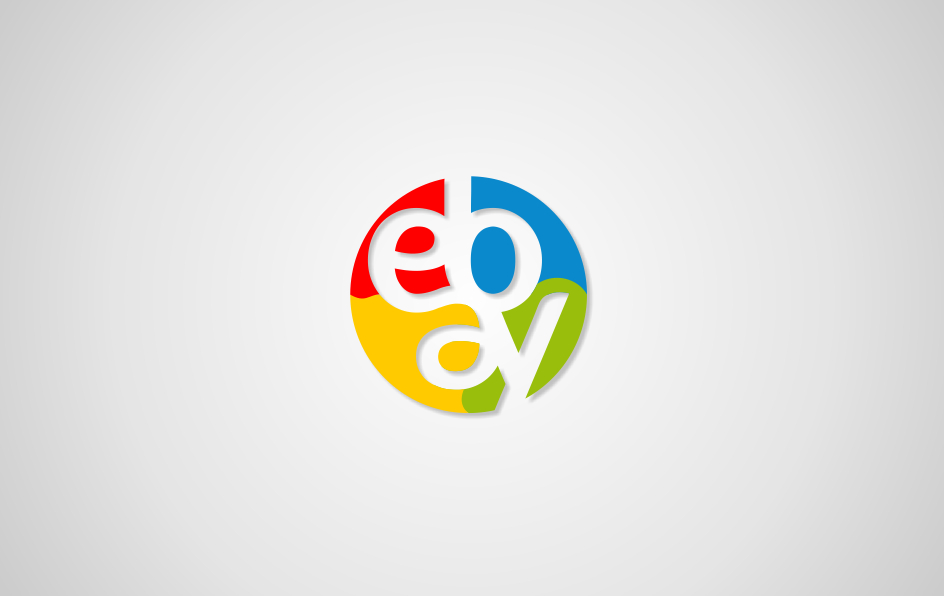
Lippincott’s new logo for Ebay recieved a lot of (mainly) bad criticism last year. After reading Brand New‘s top list of 2012 visual identities, I moved on to their list of the worst rebrands. I wasn’t surprised to see Ebay at #2… It’s a shame actually, because the new interface design is a huge improvment, and the new brand site is equally well executed. 99 Designs launched a contest for fun in October, where anyone could submit their shot at a new Ebay logo. You can check out the winner yourself here, which I thought was a bit boring considering the range of ideas shown. They range from credible (image 2) to imaginative (image 4 in Olympics style), and these are some of my faovurites. The first one is by far the best, ingenious in fact, if they’d only made the colours correspond to the letters (yes, it reads ‘ebay’ if you read anti-clockwise from the red ‘e’!). More about my own submission soon.


